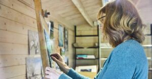
Thanks so much to Unison Colour and Arild Frisnes for inviting me to choose this month’s Eyecatchers. And thanks also to them for constantly trying to create an inclusive and encouraging community for their artists. Their amazing pastels and the people behind the company have been such an integral part of my career for many years now.
When asked to choose favourite pieces of art, it fills me with both joy and a sense of dread at the same time. How do you narrow down a selection of art from such a prolific and talented group of artists such as those who post on the Unison Colour Soft Pastelling Community? There were many that I had to leave out, but the following images were the ones that really spoke to me this month. I hope you enjoy seeing my selection.
For Eye catchers November, I invite Unison Colour Associate Artist Rebecca de Mendonca to be a guest curator.
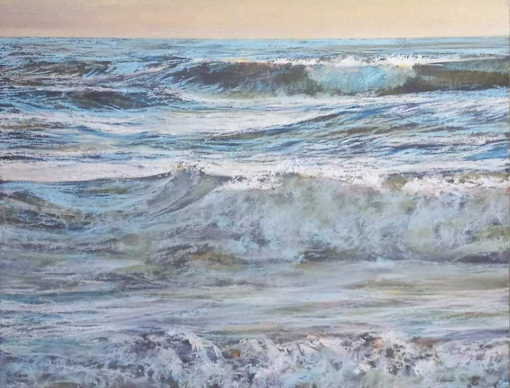
Alain Voinot’s seascape is a masterclass on tonal value. The extremely high horizon line makes us really delve into the water itself. And there we find such a range of textures and colours used to depict the movement of the water. I love the fact that it’s mostly within the mid tone range which makes me think of the soft diffused light coming from the warm sky and the sea mist.
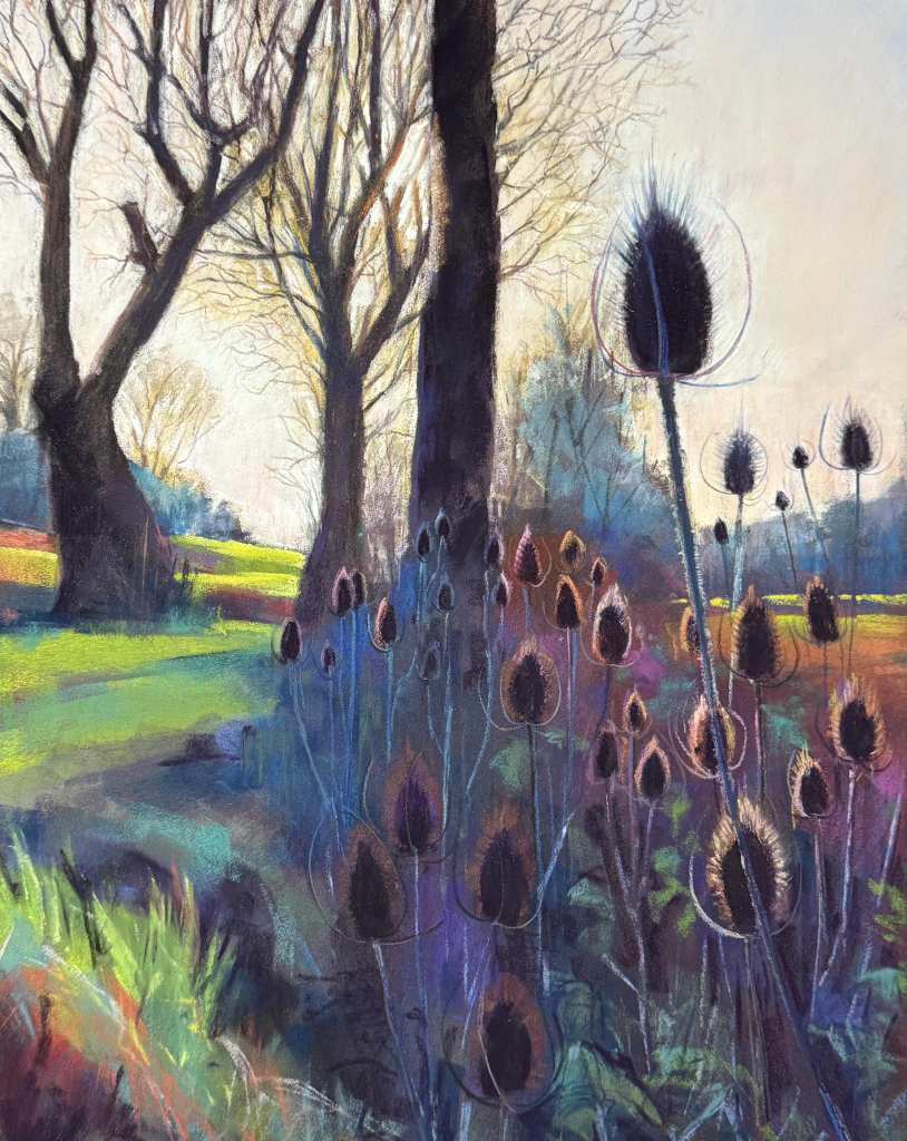
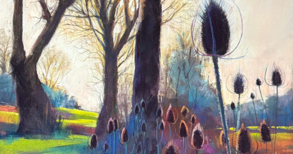
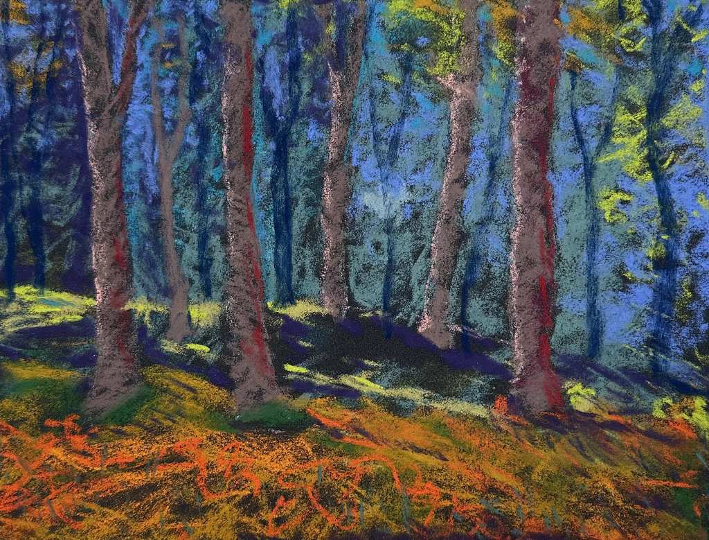
Dave Flitcroft’s colour choices just jump out at me. I would happily hang this on my own walls and enjoy those vibrant colours. The composition is very pleasing, leading our eye through the trees in the midground onwards to the distant trees. I love the warm palette used across the sky and the beautifully handled details in the foreground. This is just a gem of a painting in every way!
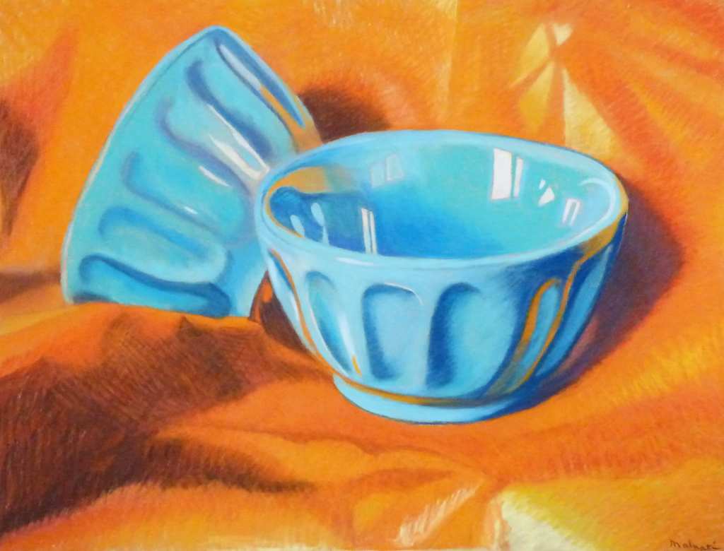
Francois Malnati has absolutely honed in on the colour theory part of our brains with this piece and the deliberate use of complementary colours to their full effect. My eyes take great delight in such bold use of colour and it doesn’t matter how little you know about colour theory. If you have eyes at all this just pops off the screen I’m viewing it on. Lovely details with the light and shade including the reflected orange colours on the bowls. So pleasing!
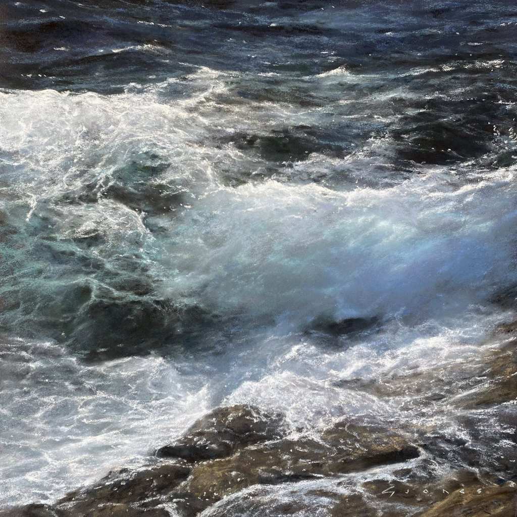
Gareth Jones is certainly a master when it comes to painting the ocean. I love the square format of this one and the way he has split up the composition almost in thirds with the diagonal of the rocks at the bottom. It cleverly puts me on those rocks afraid that I’m about to slip and fall in! Gareth always creates such luminance in crashing waves and although the piece looks photographic from a distance, up close the energy and movement in the marks is captivating.
Jennie Wood’s piece keeps me looking at it with such interest. I especially like zooming out to be hit with the colour palette all at once, and then zooming back in to see the suggestiveness of the marks. I think this style is so clever because if you get your tonal values nicely, you can go a bit wild with the colour palette. I think a dark surface has been used and that may also be why the colours seem to jump off the page. It’s not trying to be photographic, but it is certainly alive!
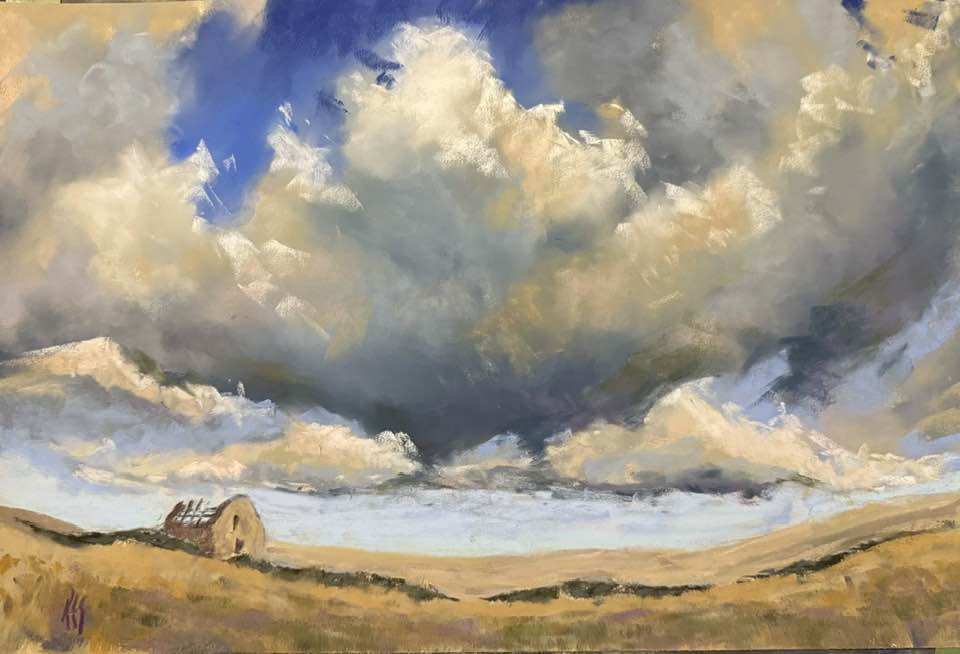
Karen Sutherland’s work feels dramatic in a remote landscape kind of way. The human element is made to feel small in the overwhelming openness of the plains. The composition works so well with the very low horizon line giving space to the vast distance captured in the sky. There is a beautiful mirroring of the colours on the land to the colours in the clouds creating harmony in the palette.
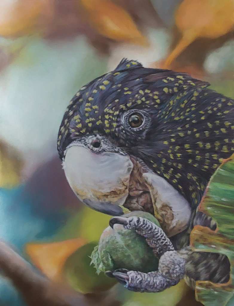
Liz Buckley’s parrot is a beautifully composed image with subtle light and shade. I love the blue violets and purples used to highlight the dark feathers and the attention to detail on the textures of the bird. All the colours get repeated throughout the piece with the soft focus background both harmonising the colour palette, and enhancing the crisp details in the foreground.
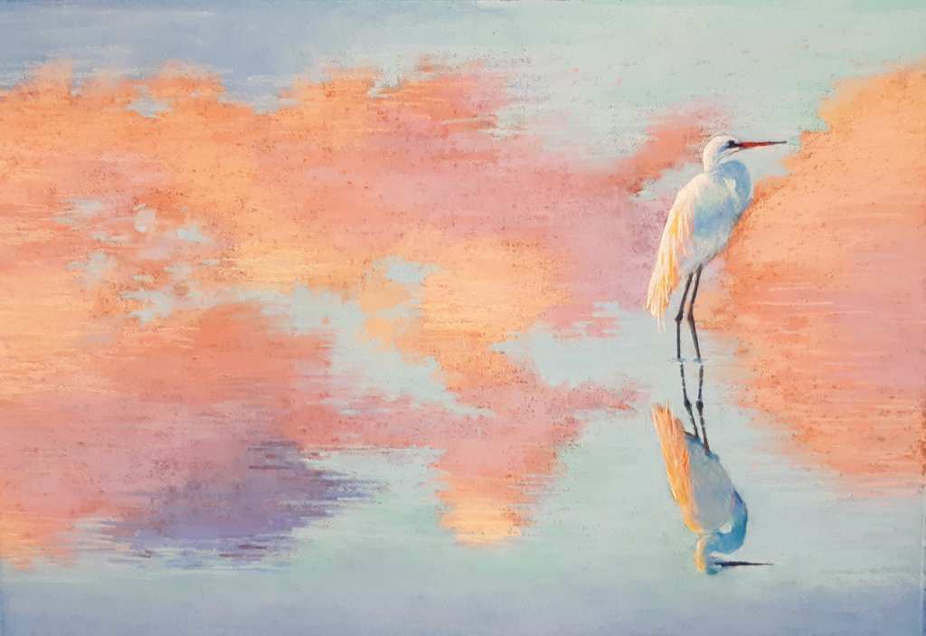
Loretta Smith created a piece that is so pleasing in terms of the colour palette and the dream like sense of space. The background can appear flat until you locate the surface of the water as indicated by the point where the egret’s feet go underwater. The trickery of water reflections is used to great effect here and it is enhanced by not showing us the horizon line at all. I love the colour palette too, it definitely adds to the soft and dreamy effect.
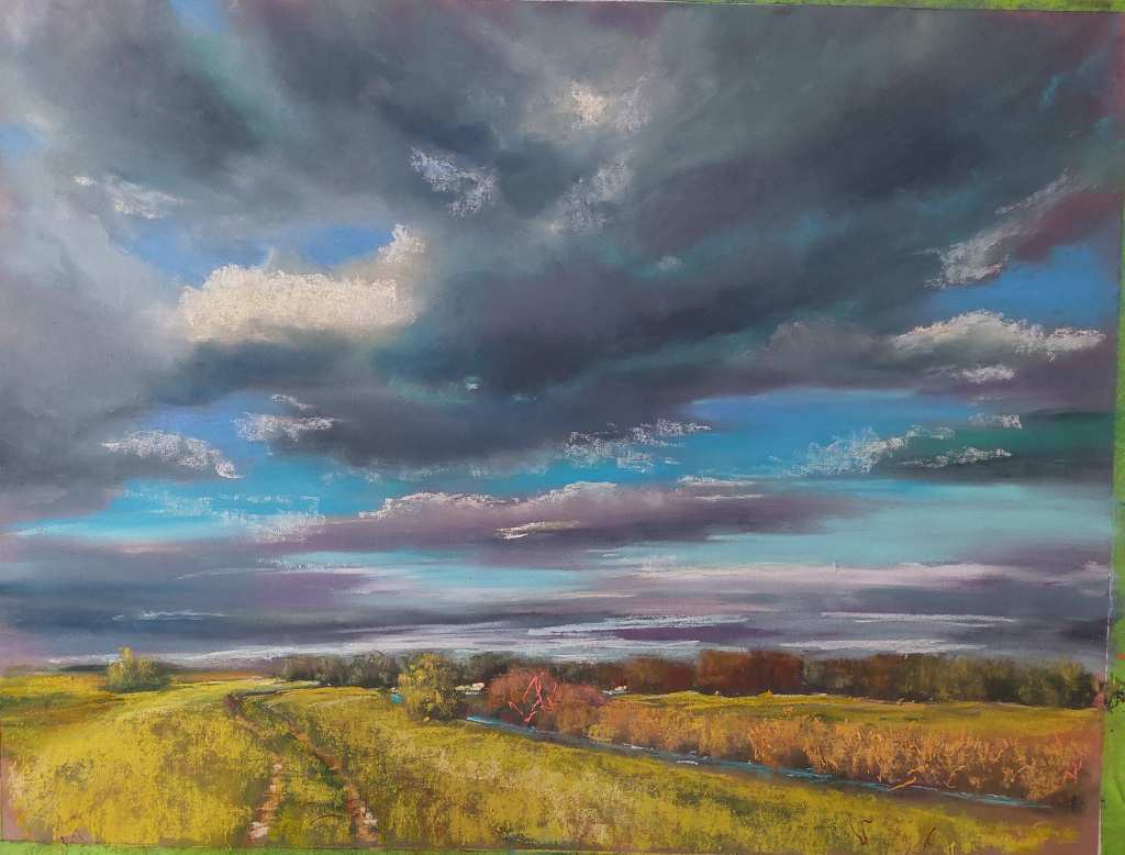
Ozlem Cakir’s landscape is another example of an extreme horizon line that works so nicely to enhance the vast feel of the scene. Again we have a lot of space devoted to the clouds which I can almost feel moving over the top of my head at high speed. I feel like this blink of sunshine comes in between big heavy showers and I’m likely to get soaked on this walk. I love how the foliage was handled with lively marks and some of the warm ground left showing.
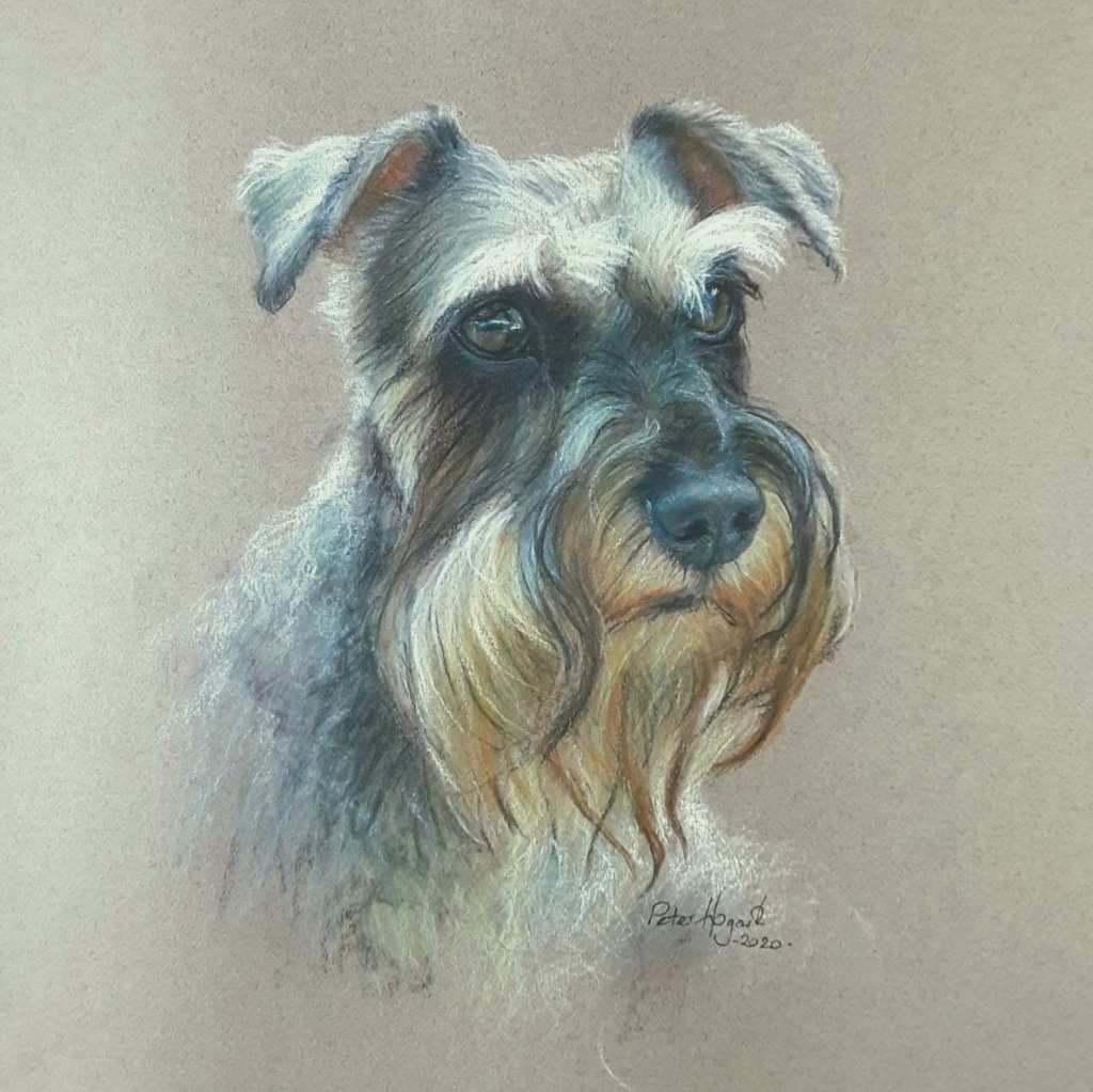
Peter Hogarth shares such thoughtful dog portraits, but I think this might be my favourite of all of his I have seen. The textures are so interesting with each little tuft of fur sprouting out in just the right Schnauzer way. I love the brown and cream tones used around the muzzle and the sense of warmth in the greys coming from little hints of a mauve colour. This breed is a very particular grey tone and Peter’s depiction is spot on.

1 comment
VanessaKirkcudbright
What an amazing selection, It really encapsulates the power of pastels – especially Unison pastels of course.